top of page

Start Strong
Notre Dame Mobile Shop Homepage
Start Strong is a mobile‑first homepage concept for the Notre Dame Shop from Fanatics. It pushes fans from hype to cart fast with a player‑led hero, clear CTAs, and quick paths into top categories.
Blending my Figma/UI skill set with experience designing for sports, I wanted to mix game‑day energy with clean, intuitive mobile shopping.
Test It Out

Graphic Notes
For the hero image my goal was to capture that same energy and authenticity of the graphics that Notre Dame's design team creates. I want fans to feel that familiarity and school pride as soon as they land on this homepage.
The graphic isn't overly complex and that is intentional. The design is confident, clean, and premium, true to the Notre Dame brand.
As for the player, I chose to design a ambiguous player that resembles one of the best returning players in all of college football - Jeremiyah Love.


For the banner graphics, I wanted to create a template that is easily customizable, showcases the product and title clearly, and leaves space for an actionable button.
This creates a system for new banners to be subbed in and out with ease which is crucial when trying to keep up with the rapidly-changing sports scene.
UI/UX Notes
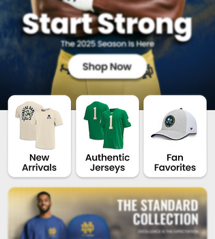
I added quick entry tiles to give people fast options that match what users reach for the most, like new arrivals and jerseys. I set them so they peek up from the bottom of the first screen, which hints there is more below and encourages the first scroll.
I used a rounded corner grid to give the section a modern, app like feel and clear tap targets. The uniform tiles create a steady visual rhythm that is easy to scan, so shoppers can pick a lane quickly without feeling overwhelmed. Simple imagery and labels keep it product first while the grid keeps the page clean and consistent.


I designed the On Sale section as a horizontal carousel so users can swipe right and scan deals without adding a lot of page length. Each card uses a clear price hierarchy with the sale price first and the original price struck through, so savings are easy to see. The next card peeks in slightly to suggest movement and invite the swipe.
Conclusion
This concept blends a college football sports graphic mindset with modern mobile UX. The result is a clean, premium look that aligns with Notre Dame’s brand and keeps product front and center.
I also used Figma components to showcase some interaction concepts: a banner that automatically cycles through multiple merch promos and a horizontal carousel that slides products in from off screen, using component variants and clipped frames.
The aim was to bring game‑day energy into a smooth, intuitive shopping experience.


bottom of page